Thursday, June 17, 2010

Kindergarten Fagerborg / Reiulf Ramstad Arkitekter

I was looking at arch daily today and got a massive shock when i saw this kindergarten design:


I saw such similarities with my kindergarten design and the Fagerborg. While my design is on a much smaller scale and is more extreme with the angles i was surprised a current kindergarten design that was so angular. I know many peoples reaction to my kindy design is that its too angular and dangerous and that kindy's should be round with curves. But this design in the 'real' world has taken the same outlook as myself!


Im reassured that my design intent is feasible and shouldnt get shut down on the basis of it being hard not soft for a kids environment.

Jinbocho Theatre_Tokyo

Amos put me on to this building as it draws similarities between the kindergarten design.

I find real life exemplars interesting as they have been constructed and give way to showing me how to design for construction. This Building's facade has been welded together without a single bolt.

http://pingmag.jp/2008/07/07/crossbreeding-shipbuilding-with-architecture/


Tuesday, June 15, 2010

final folio- kindergarten


sleeping pods exterior


I believe this was a quailty shot of the sleeping pods, i didnt have a place for it on my panels but i think it provides a clear image of the context. The pods are a cocoon on the exterior of the library.

also try to image the material application, of a green roof acting as a relief on the corten like metal.

the bathroom-forgotten

i realised i had not included any internal viwes of the toilet in my presentation.
I had worked on the bathroom configuration so it seems a waste not to include it on the blog atleast.


its a basic section through the bathroom showing stalls and hand basins.

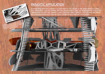
para-section

The following two images show the sections through the library and kindergarten in context.


Wednesday, June 9, 2010

grass relief?

After looking at the photoshop render i thought that perhaps i needed to give the building some more relief from the metal and timber. make it a little more child friendly haha.

a friend sent me the following images. Im not sure where the building is but it could be good to incorporate the grass relief into my exterior or even interior :)

If anyone knows where this building is please tell me...


material application


i spent 3hrs doing this photoshop application on tuesday night :)

Ive applied a cor-ten like steel, to insight the crumple zone feeling, aswell as timber slats and grass for play areas.

Tuesday, June 8, 2010

Material Application

Materiality of my kindergarten is very important. I had previously decided that the slats would be timber:

The solid panels which make up the kindergarten are to be metal such as corrugated iron, or the such. A metal compliments the timber nicely and draws motifs on the "CAR CRASH ZONE" refering back to my foli in week 3. Ive applied a metal to the sleeping pods as shown:


I have had difficulty applying these materials in 3ds max, and decided that i best not waste hours and stress in the program. Instead ill do clay renders and photshop in materials after.

'On vous raconte des salades’


I was procrastinating on Arch Daily and saw another concept design which holds similarities with my design.

Its called On vous raconte des salades’ which translates to "to spin a yard'.

Monday, June 7, 2010

closing the kitchen up

Ruwan made a comment about the kitchen looking odd outside.
I believe that the kitchen is best outside of the main building and works well in space planning. As the children can use the kitchen as an interactive learning space and eat lunch then go play on the outdoor jungle gym area. Its all briefed as 'outdoor' time.

But in considering Ruwans comment i can see how as the kitchen stood, it looked very exposed and not well defined. I decided to counteract this by applying the hydrualic doors. So they open up for shealter just as the main doors to the kindy do.

this provides more shealter aswells as closure when the kitchen is not in use.


This is a very rough example of how the doors will open up...im struggling to show it correctly with no align tool in sketch up- think i just need more patience thou.
its very rough.

test renders on connected parasite

Stuart was kind enough to merge my model with his model and produce some test renderings. The merge of the two buildings was successfull with only minor design alterations. eg...my sleeping pods step down not up anymore.

Heres are a few images.


We still need to add materials, and put it in the context of the bridge.

thickness!

9hrs later and a very sore wrist from moving my mouse i have thickness (walls and ceilings) through my entire model.


Ill have to export it into 3DS toget proper renders of the sections but it nice to see more structural integrity to the design.

Post Crit

From the Crit Ruwan gave me some things to improve on for the final hand in.

1.add thickness to my model eg walls, ceilings. (i knew i still had to do this as my sections werent very powerful)

2. add materials to my model. (i was expecting this, as i have moved on from concept stage, white renders wouldnt cut it, ill be adding wood primarily to the model. -perhaps coloured to stimulate the children)

3. Context - i need to show my model inside Stuart's library and then the greater area of the bridge and education precinct.

4. structure for my parasitic access's between stu's and mine. - i feared this as ive previously tried to add structure but its super hard to work in sketchup and i feel it distracts from my design intent. Ill have to work something out thou :)


the following image is of my physical model and stuarts. The two obviously dont fit correctly as mine is to 1:100 and the library is 1:200.

Friday, May 28, 2010

making the physical model

As this design project has a certain amount of dependancy on everyone else's designs i wanted to make sure i had a physical model to put mine in context with everyone else.
I didnt know how to tackle the 'random' triangle angles and sizes but ended up doing a lengthy process of section cutting each triangle/other face and putting that into AutoCAD where i was able to laser cut it.

The trick was to make sure each triangle had been allocated a number and a description so i could accuratly place them in the right spot to have a closed up model. I built it on a print out of the floor plan:
I wouldnt have been able to achieve such great acuracy with the lourver system if i had done it by hand (i didnt have the time to be careful with my craftman ship) so the laser cutter proved to be perfect when doing a model at 1:100

The above image shows the wall's which i hope to do an animation of them opening :)


I didnt close the entire model up (yet) as i didnt laser cut each face of the building...it was too confusing at the time as too which faces i still needed...i can stll close it up by hand . NB The sleeping pods and the kictchen outside has yet to be physically modeled as well.

Tuesday, May 25, 2010

Kindergarten Triva

There is over 60 solid faces acting as walls, roof, or floor within the kindergarten main building.

(i section planed these faces to be laser cut phew)

Pepakura attempt-fail!

Okay so i was getting frustrated with trying get my triangles flat for laser cutting-sketch up doesnt have an align tol, and rotating is very fiddly!
I tried Ruwans suggestion of Papakura but im not too sure how is meant to work
This is what a simple area folded out to be:


I have no idea how im suppose to fold the lines?

Back to working out another way for me to get my triangles for a physical model by thursday EP.

Monday, May 24, 2010

Let there be Light!


As in my concept design i have applied the louver system which allows light to penetrate the building yet keeping privacy....
It creates an interesting light effect inside.
As the kindergarten is within the Library i have to think of soundproofing as children are known to be loud. I wanted to keep the 'open slits' open but perhaps ill have to add a glass? This distracts from the original design plan to let the children climb and explore...im not sure but atm i want to keep the slits open..time will tell

This is with natural light penetration-im thinking of adding strip lighting to bring more light in-perhaps different colours to stimulate the childs imagination? -dont want it too look like a club thou HA

3ds Render_I CAN DO IT!

So my fear of not being able to render a section is GONE!
Ruwan helped me import a dwg file from sketch up to 3ds max and use the 'slice' tool to represent a montage of sections showing the kindergartens depth! the following images are preliminary but have motivated me further!
I used a clay render for this effect


The next image is a floor plan-looks awsum! very zaha hadid!